Well I’ve managed to complete several blocks and some of the sashing pieces. I’ve been experimenting with different layouts to try and decide how I want to finish my On Ringo Lake quilt.
Here is my on-point layout as it was designed by the author Bonnie K. Hunter:

Here are the same blocks with them arranged in rows and columns rather than on-point:

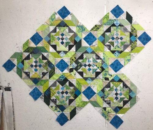
Here are some of my own ideas that I have been playing with. I doubled up the sashing to create a secondary design and added blue blocks (on-point and standard layouts). If I pick this design I am going to add a variety of different blue blocks to keep with the scrappy look.


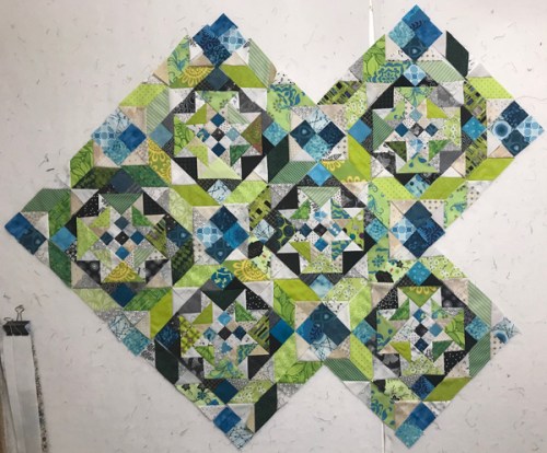
And these two use a four patch instead of the solid squares:


I can’t decide which one I like best. Any and all opinions welcome.
Linking up to the Mystery Monday linkup at Quiltsville’s Quips and Snips


I thin You made a great job. It is a good idea to use double sashing and scrappy blue four patch.
I love the double sashing! I think the solid blocks help anchor and focus the busy ness of the main blocks. I may try this when I get to the sashing
on mine!
I quite like your double sashing, on-point one with the large blue cornerstones. Have fun deciding!
I love your colors. My favorite would be the double sashing with 4 patches
I think I would make more blocks before making a decision about the layout. Sometimes a layout looks great with six blocks, but not so good with 25. Love your color choices, and I think the blue cornerstones add interest, and look nicer than the grey tones in the first photo.
If you use a straight layout instead on on-point, isn’t that going to change the size of the quilt quite a bit? You won’t need setting triangles (Bonnie’s border design), but you may have to make extra blocks and/or design a different border if you want it to fit a bed. Or be like me: sew first, then panic when I run out of fabric in those colors! 😉
in the Flow of things, my personal fav is diagram #3….like the feel of it…(LOVE all the colours in that quilt…it’s truly is beautiful!!!! (as are all of them)
You can’t go wrong here because they are all beautiful!
I really like the double sashing effect, and wondered about a square in a square block with a blue centre and 4 neutral corners. That would emphasize the secondary block effect you have going with the double sashing.
I really like the double sashing with the blue cornerstones on point. It gives your eyes a place to rest and I think it showcases the blocks the best. They’re all nice, but that’s my favorite.
I like the addition of the solid blue blocks. It really makes it pop.
I decided to set mine in straight rows instead of diagonal. I love the look of diagonal, but I’m not fond of sewing the blocks together that way, lol. I really like your double sashing. Very striking!
I like the effect of your doubled up dashing; also prefer the solid cornerstones for your blocks.
All of those ideas look great. It’s really too bad we don’t have time to make all the quilts we design and dream about!